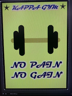
KAPPA GYM poster advertisement (full for presentation)
Part 1. Idea and Sketch
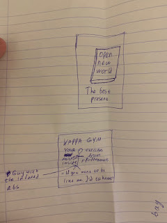
 On our Digital arts class I and Kleidir worked together on the idea and implementation of the poster. Firstly, we had totally different ideas. I wanted to create a book poster when he wanted to put his name on sports equipment. Secondly, we found the touch point thanks to the teacher. It was idea to create a gym advertisement poster. After that, we made sketch how it have to look.
First sketch - My idea for first poster
Second sketch - Our idea how the Gym Poster should look
Part 2. Implement in PIXLR
 On our Wednesday lesson we used PIXLR to create our advertisement poster. One of the problem was that PIXLR is not a very good website to create anything greatest. Because of that, I wanted to do poster as easily as I can. I made a poster for the gym for approximately 20 minutes and it was not look like we wanted. To realise it, I used simple tools such as text and drawing tool.
As you see, there are only few words, two stars and dumbbell. I asked few my classmates for their opinion about this work (include Kleidir) and only one Leo said that it looks interesting when other people opinion was that it looks cheap.
After that, we wanted to realise it with 3D text and I tried to create another poster in Cinema 4D
Part 3. Implement in Cinema 4D
I wanted to do same design, but more interesting
and add neon lightning in Cinema 4D. By the way, I have Corona render, because they have better materials, lights, settings and render is more comfortable and faster than standard. I made 3D text and background with walls. I used simple tools again to create it more easily. For example, I used spline text + spline circle + extrude sweep to create 3D text, after that I put color material and increased self illumination to 10 to make the text neon. After that, I used cylinder + 4 torus to create to a small dumbbell and copy them for even distribution across the poster.
I put main texting information, which in my opinion may be of interest to potential customers. Here I used only the motivate slogan, information about price and the neon arrow implies that entrance to the gym is under the poster. Unfortunately, Kleidir didn't like this idea, because he wanted to put photo and more information about the Gym. In addition, the neon lighting was not good for my partner.
I added information and chose gold material (https://www.corona-materials.de/en/material-library/metal/wich-gold/229) for text information, because It looks more better than with other materials. I found some photos on Pixabay. In search I used - gym arm, because its main idea to go to gym and only vertical photo, because poster is vertical and horizontal images are not fit.
Unfortunately, idea to put photo with many text was not good, because no matter how I tried to make text on top of the photo, there were always problems with understanding what was written.
There are some examples below
Part 4. Research
I checked how gym advertisement poster look like only after I made name varieties of our poster. I found gym advertisement posters in google search and they are absolutely different in comparison with our works
For this reason and not the best quality of previous works, we had to throw them all out and start over in photoshop. The moral is, if we had looked at what an advertising poster should look like right away, it would not have taken us so long time to implement it.
Part 5. Final implement in Pixlr Editor
When we could not do poster in Cinema 4D and research has shown that we initially did poster incorrectly, Kleidir decided to make a more understandable version in PIXLR.
The background:
We used a background with a actrative color roasted yellow with beige and we work on the degrade.
The Picture
We decided to use dumbbells because it is something that calls attention when we want to talk about gym and for us one of the best way to repesent our message.
To make the picture we use a Nikon D3400.
To remove the background of the picture we use a website : Background Burner.
Software
SOURCES:
We used Pixlr Editor and Fotojet both two pratical image editors with essential tools.


Comments
Post a Comment